 Paramount's ident has a very magical feel to it by having the stars around the name of the company. When stars are mentioned when talking about films and film production companies we often think that it will either be a very good or high up company or film. This ident gives us the impression that it is a very powerful world wide company, which is very strong and independent, due to the name being on top of a mountain, as if it is a lot higher up than the rest of the film companies i have mentioned with this research.
 Miramax Film's ident is one of the most simple idents around. By using a bold white font against a black background makes it eye catching, and lets it stand out to the audience.
the simplicity of this ident could show to some people that the company is not as big and powerful as companies such as 20Th Century Fox.
The font blends into itself which is very simple again.
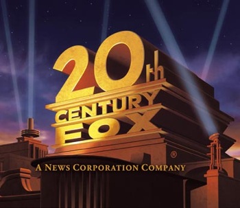 20Th Century Fox's ident is one of today's most recognisable idents around. The ident looks as if it is a large stone building, with lights shining all around it to create focus on the company and the film that would be watched after showing the ident. Making the name of the company look as though it is a building creates the image that this company is world wide, popular, and very powerful, which should be like the film the audience would watch which would be produced by them.
Pixar Animation Studio's ident is very simple. By using black font against a clear blue background it emphasises the word 'PIXAR' making it more visible. Pixar have a very recognisable logo, which is the lamp that is used to replace the 'I'. When seen in places such as cinema screenings or DVDs. the lamp is animated, to usually bounce up and down. This again makes the ident very recognisable, and a lot of people remember it well, because there are not many like this.

No comments:
Post a Comment