
DreamWorks ident is a really fantastic way of enforcing the company title. for a start the saying "you've got your head ion the clouds" is said when you completely zone out of are dreaming and i think by putting the clouds on here that's the effect they are going for. The crescent moon with the boy sat on it fishing clearly displays a dream sequence and that you can do anything you want to in your dreams. We know that It is a dream because it is impossible for a Boy to sit on the moon and fish but it really gives a believable feel to the picture and shows an element of magic to the ident. Because the clouds look bigger closer to the screen it makes the audience feel like they are there too and so it looks like they are dreaming. I think the company also want you to believe that the journey of the film you are about to watch is going to be so good it will be like a dream. This ident does come alive and just shows the boy fishing enforcing that magical feel.

Working title films uses a very simple font and image to create their ident. The white background give a simplistic effect and contrasts with the bright blue font and really establishes the words to make them look really bold. The circle surrounding the end of "WORKING" gives difference to the ident and changes it from just being two words. The faded colour on the circle give it the 3D effect and makes it look like it is coming out at us. i think the way they have constructed this ident is clever because it puts the point straight out there with no distractions. I think the ident is good but a little boring and doesn't really intrigue an audience.

The Warner brothers ident looks quite simple but does have depth to it. Firstly the background shows a sky with clouds in, this could be to show how the logo is in a different world, or that it is so important it is in a godly place (high above). The shield shape containing the words displays information about the company. It is very clever because the shape containing the "WB" looks like a shield but also fits the words in as if the shape was moulded to fit them in. the band crossing the logo gives the logo a planet feeling as it looks like a ring surrounding it, this could also tie in with the fact that it is in the sky. across the ring it clearly states the name of the company and by putting "PICTURES" it tells an audience it is a film company. I think it is a really good ident and is cleverly designed to create mass impact.

The Walt Disney logo is based around a film and was created from there. Because Disney's films are about fairy tales the ident had to tie in with it. the picture displays Sleeping Beauty's castle that is placed in Disneyland Theme Parks around the world. the picture took to make the ident comes from the castle in Florida which is a copy of the cartoon castle from the film Sleeping Beauty. in front the text clearly states the name of the company in a handwriting that is very recognisable. the "D" is very recognisable and is known popularly worldwide. The name of the company comes from the founder Walt Disney and so is displayed on the ident. the way they have computer generated the sky to look blue and pink, this works well as it looks like a fairytale. the whole feel of the ident gives a magical feel and really intrigues the audience. For the type of films that Disney produces this ident is perfect and i think it ties in really well with all things connected with Disney.
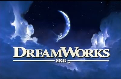 DreamWorks ident is a really fantastic way of enforcing the company title. for a start the saying "you've got your head ion the clouds" is said when you completely zone out of are dreaming and i think by putting the clouds on here that's the effect they are going for. The crescent moon with the boy sat on it fishing clearly displays a dream sequence and that you can do anything you want to in your dreams. We know that It is a dream because it is impossible for a Boy to sit on the moon and fish but it really gives a believable feel to the picture and shows an element of magic to the ident. Because the clouds look bigger closer to the screen it makes the audience feel like they are there too and so it looks like they are dreaming. I think the company also want you to believe that the journey of the film you are about to watch is going to be so good it will be like a dream. This ident does come alive and just shows the boy fishing enforcing that magical feel.
 Working title films uses a very simple font and image to create their ident. The white background give a simplistic effect and contrasts with the bright blue font and really establishes the words to make them look really bold. The circle surrounding the end of "WORKING" gives difference to the ident and changes it from just being two words. The faded colour on the circle give it the 3D effect and makes it look like it is coming out at us. i think the way they have constructed this ident is clever because it puts the point straight out there with no distractions. I think the ident is good but a little boring and doesn't really intrigue an audience.
 The Warner brothers ident looks quite simple but does have depth to it. Firstly the background shows a sky with clouds in, this could be to show how the logo is in a different world, or that it is so important it is in a godly place (high above). The shield shape containing the words displays information about the company. It is very clever because the shape containing the "WB" looks like a shield but also fits the words in as if the shape was moulded to fit them in. the band crossing the logo gives the logo a planet feeling as it looks like a ring surrounding it, this could also tie in with the fact that it is in the sky. across the ring it clearly states the name of the company and by putting "PICTURES" it tells an audience it is a film company. I think it is a really good ident and is cleverly designed to create mass impact.
No comments:
Post a Comment