
STORY BOARD.


 ostume for the character of the cottage maiden. The white shirt is of the period and is just basically a normal blouse. the brown skirt shows how she is in a lower class as the colour brown is associated with dirt and therefor gives the audience a lower opinion of her. The waistcoat/corset fitted found the torso and shoulders to create a top effect. This works well because it is also brown which show lower class. however it does have green in it which could be perceived as her liking the outdoors and as it says in the poem "i was a cottage maiden hardened by sun and air" this shows that she is an outdoor person.
  This is the costume for the little Kate. the white symbolises a purity theme throughout the girl which is really important at the symbolism will be brought across in the shots.
 pinny fore.
Slugline | This scene is shot in the morning | Scene No. | 1 |
Endpoint of last scene | N/A (first scene) | ||
Characters in scene | Little Kate Little Cottage Maiden | ||
Point of scene | To display the youth and friendship between the girls this then changes later in the film. | ||
Scene description
| |||
Slugline | The scene is shot in the middle of the day | Scene No. | 2 |
Endpoint of last scene | The girls have just run in the field and a title comes up. | ||
Characters in scene | Cousin Kate (18) Cottage maiden (19) | ||
Point of scene | To show the difference in the relationship and ignorance towards each other. | ||
Scene description
| |||
Slugline | The scene is shot in the middle of the day | Scene No. | 3 |
Endpoint of last scene | A shot of Cottage maiden looking behind her at Kate is shown. | ||
Characters in scene | Cousin Kate (18) Cottage maiden (19) | ||
Point of scene | To show the difference in the relationship and ignorance towards each other. Enforced stronger. | ||
Scene description 1. Kate is stood by a gate as it says in the poem.
| |||
Slugline | The scene is shot in the middle of the day | Scene No. | 4 |
Endpoint of last scene | Kate looked back at gate | ||
Characters in scene | Cousin Kate (18) Cottage maiden (19) | ||
Point of scene | To show Cottage Maidens everyday life and compassion. | ||
Scene description
| |||
Rehearsal schedule
(action plan for the day)
Date – 19th February
9.00 – ALL CAST try on costumes make sure they fit, adjust ready to film for 10.00
10.00am – Film Scene 1 – Little Kate and Little Cottage Maiden needed
LOCATION – Field, off Bury lane, West Morton
PROPS – none
11.30am – Film Scene 2 – Kate and Cottage Maiden needed
LOCATION – Footpath, Bury lane, West Morton
PROPS – none
BREAK – 30 minuets
1.00pm – Film Scene 3 – Kate and Cottage Maiden needed
LOCATION – Bury lane, West Morton
PROPS – none
1.40pm – Film Scene 4 – Cottage Maiden needed
LOCATION – Deanhole Stables, West Morton
PROPS – Sweeping brush, Horse.
 Paramount's ident has a very magical feel to it by having the stars around the name of the company. When stars are mentioned when talking about films and film production companies we often think that it will either be a very good or high up company or film. This ident gives us the impression that it is a very powerful world wide company, which is very strong and independent, due to the name being on top of a mountain, as if it is a lot higher up than the rest of the film companies i have mentioned with this research.
 Miramax Film's ident is one of the most simple idents around. By using a bold white font against a black background makes it eye catching, and lets it stand out to the audience.
 20Th Century Fox's ident is one of today's most recognisable idents around. The ident looks as if it is a large stone building, with lights shining all around it to create focus on the company and the film that would be watched after showing the ident. Making the name of the company look as though it is a building creates the image that this company is world wide, popular, and very powerful, which should be like the film the audience would watch which would be produced by them.
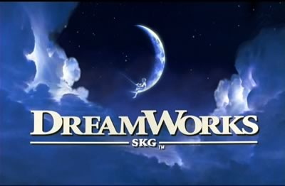 DreamWorks ident is a really fantastic way of enforcing the company title. for a start the saying "you've got your head ion the clouds" is said when you completely zone out of are dreaming and i think by putting the clouds on here that's the effect they are going for. The crescent moon with the boy sat on it fishing clearly displays a dream sequence and that you can do anything you want to in your dreams. We know that It is a dream because it is impossible for a Boy to sit on the moon and fish but it really gives a believable feel to the picture and shows an element of magic to the ident. Because the clouds look bigger closer to the screen it makes the audience feel like they are there too and so it looks like they are dreaming. I think the company also want you to believe that the journey of the film you are about to watch is going to be so good it will be like a dream. This ident does come alive and just shows the boy fishing enforcing that magical feel.
 Working title films uses a very simple font and image to create their ident. The white background give a simplistic effect and contrasts with the bright blue font and really establishes the words to make them look really bold. The circle surrounding the end of "WORKING" gives difference to the ident and changes it from just being two words. The faded colour on the circle give it the 3D effect and makes it look like it is coming out at us. i think the way they have constructed this ident is clever because it puts the point straight out there with no distractions. I think the ident is good but a little boring and doesn't really intrigue an audience.
 The Warner brothers ident looks quite simple but does have depth to it. Firstly the background shows a sky with clouds in, this could be to show how the logo is in a different world, or that it is so important it is in a godly place (high above). The shield shape containing the words displays information about the company. It is very clever because the shape containing the "WB" looks like a shield but also fits the words in as if the shape was moulded to fit them in. the band crossing the logo gives the logo a planet feeling as it looks like a ring surrounding it, this could also tie in with the fact that it is in the sky. across the ring it clearly states the name of the company and by putting "PICTURES" it tells an audience it is a film company. I think it is a really good ident and is cleverly designed to create mass impact.